Arctic Sea Ice: What Good The Climate Models?
Fanfare on The Guardian’s “Fact are sacred” DataBlog for the publication of a graph-cum-spreadsheet about Arctic sea ice: “Scientists are fighting back over climate change. Get the data behind the latest battle – and see how we visualised it“. (*)
A major Met Office review of more than 100 scientific studies tracking the observed changes in the Earth’s climate system finds that it is an “increasingly remote possibility” that human activity is not the main cause of climate change
Wow!
It’s just such a pity the figures provided don’t show much beyond scientists being vaguely able to devise models where Arctic sea ice decreases as it has been doing for a while (hardly the information you need to have a PhD to understand).
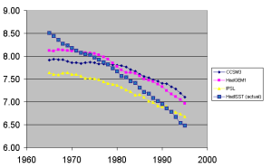
First of all, usual remarks about bad scientific communication and shoddy journalism. The spreadsheet allegedly showing “Arctic sea ice extent – the different measures” contains just a single column that could be described as “data“, in the sense of being related to “facts”: “HadISST”. The other three columns (“CCSM3”, “HadGEM1”, “IPSL”) are numbers coming out of climate models. That’s no “data”, or “measure” in any scientific sense.
“Fact are sacred”??? I do not think so.
Anyway, the spreadsheet is easy to download and it takes seconds to compute the correlations between the columns. In particular, between 1950 and 2009, the correlations between the actual sea ice extent HadISST and the models’ outputs are:
1. CCSM3: 0.73
2. HadGEM1: 0.72
3. IPSL: 0.62
In any other scientific endeavor, the appallingly low results above would have closed the debate and sent the scientists back to the very beginnings of their efforts. But this is climate science, so why not apply a centered 30-year average filter and see what happens?
(nb: this narrows the temporal window to the 1965-1995 period)
These are the correlations between the HadISST (averaged) and the models’ outputs:
1. CCSM3 (averaged): 0.97
2. HadGEM1 (averaged): 0.99
3. IPSL (averaged) : 0.98
The value for the second model differs from unity by just seven parts in a thousand. Eureka! Trebles all around! Now we’re talking.
Or are we? After all, correlations cannot be the end of the story (Anscombe’s quartet and all that). Given also that The Guardian make a point about having “visualised” the “data“, let’s have a look at some graphical representation here too.
There is one thing in common between the 4 lines: they all go in the same direction. Evidently though, none of the three models could be thought as a good…model for the actual sea ice extent data: they are grossly underestimated at first, with two of them (CCSM3 and HadGEM1) grossly overestimated at the later dates.
IPSL might become a good match at the end of the series. On the other hand, this result reminds one of the debate around Reifen and Toumi’s “Climate projections: Past performance no guarantee of future skill?“. At different times, different models are more right than the others. Unfortunately, there is no way to know that in advance, so the models become as good to foresee the future as a Nostradamus book. It’s all written there…after the fact!
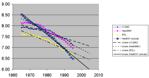
The situation is even worse if a little trend is added:
Simply put, the models go in one general direction, the actual data in another. The only thing in common is that they all decrease: for everything else, we might as well have plotted phenomena and computations that had nothing to do with each other.
This is what we can say thanks to those “scientists fighting back” and The Guardian:
- Arctic sea ice has been decreasing
- People are able to devise climate models where Arctic sea ice decreases too
- That’s it
Going back to the Guardian’s blog and graph, we can therefore understand that all it shows is squiggles moving more or less in the same direction of other squiggles.
Is that something we can reasonably use to state that “it is an ‘increasingly remote possibility’ that human activity is not the main cause of climate change”? I guess not. Especially considering the role of winds and currents: with the added bonus that those can actually be seen at work, in the real world.
Does this all matter? Yes it does. Think of having a stomach ache getting worse and worse and having to deal with a doctor fixated it’s gallstones. Yes the pain might increase under both circumstances but a wrong diagnosis remains a wrong diagnosis, and a dangerous one at that as the cure might be completely wrong.
(*) does anybody know what did Luboš Motl write that was so awful, it had to be removed from the Guardian’s blog’s comments section?


You may have already seen this, but just in case: I done an analysis relating to Arctic sea ice. There is a strong suggestion that all the apparent ice extent decline might be accounted for by measurement drift in SSM/I.
If correct, then the model predictions are worthless.
Click to access How_Fast_is_Arctic_Sea_Ice_Declining_v2.pdf
Sorry about the typo. It should have read:
“I’ve done an analysis relating to Arctic sea ice.”
Hi Maurizio, while I sometimes write things that others consider awful, I chose the Guardian as one of the places of my extremely polished, polite image. 😉
So the comments that were erased were completely innocent, just inconvenient. Because much more far-reaching comments survived under other articles, I suspect that there are different moderators under each, probably linked to the author.
Concerning the topic, it’s of course a pretty weird – and let’s hope that hopeless – attempt to “clean” the minds of the readers. In the last 10-15 years, there’s been no warming and there’s been an escalating amount of discrepancies between the observations and the climate models. So it’s just physically impossible for the last 10-15 years to have increased our confidence that all/most warming had to be man-made and is bound to be dangerous in the future.
Nevertheless, there are people in the Guardian, Met Office, and other places – not all of them, but there still are – who want to preserve the old “everything is settled in our favor” message. So they created this new wave of P.R. Probably still better than personal character assassinations that are being planned in the mind of Paul Ehrlich.
OK, anyway, I don’t think that these things are too important today. It’s like the last pockets of German soldiers in May 1945 in Berlin.
Best wishes
Lubos
Lets see. If we measure the temperature change every minute from 6am to 7am, we will find catastrophic warming. If we put the temperature data from 6am to 7am in a computer model, we will predict catastrophic warming beyond then.
We have about 20 good years of climate data since IPCC started trying to measure what’s happening. Do we really think we can predict a century? That will take us from 7am to noon – gosh it’s still warming.
would all idiots trying to post silly comments please take notice that it is possible via WordPress to figure out who you are, even when the “posting” is anonymous. but I wouldn’t usually bother.
you are a *****. seriously.